Animated chart examples
Real observations. Editable charts. Each example comes with the source, the underlying values and a video you can download. These six comparisons cover five selected countries from 2000 to 2023.
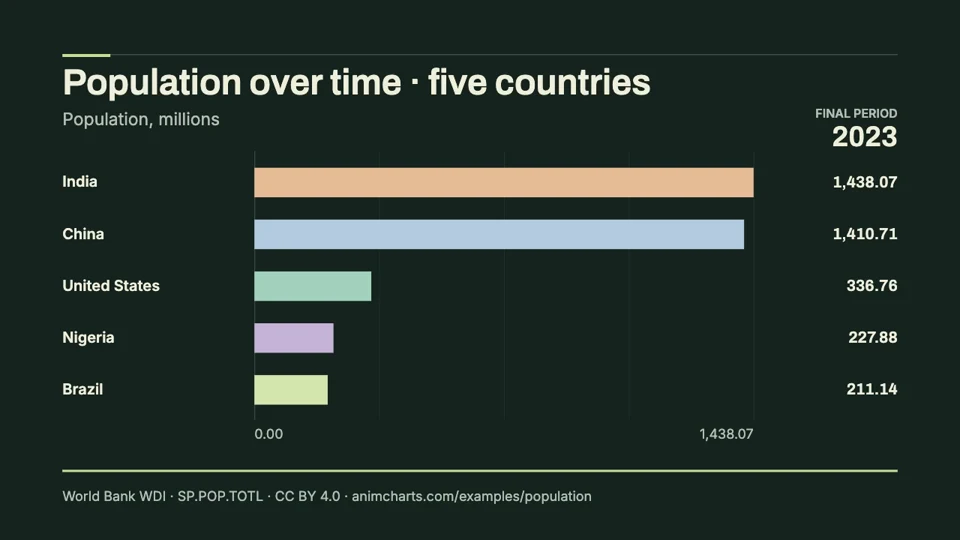
Population over time
Compare the changing population sizes of Brazil, China, India, Nigeria and the United States. This editable animation uses World Bank midyear estimates and a fixed scale measured in millions.
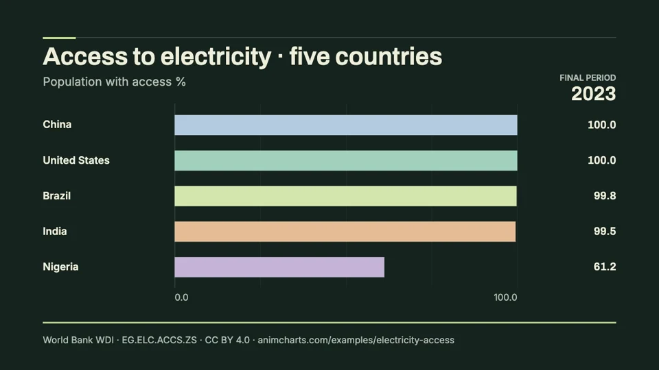
Access to electricity
Animate the share of residents with access to electricity in five countries. The downloadable CSV and MP4 use World Bank electrification estimates, with values expressed as percentages of each country’s population.
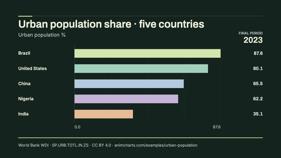
Urban population share
See how the proportion of residents living in urban areas changes across five countries. This ready-to-edit chart race includes the World Bank series, a reusable CSV and a downloadable video.
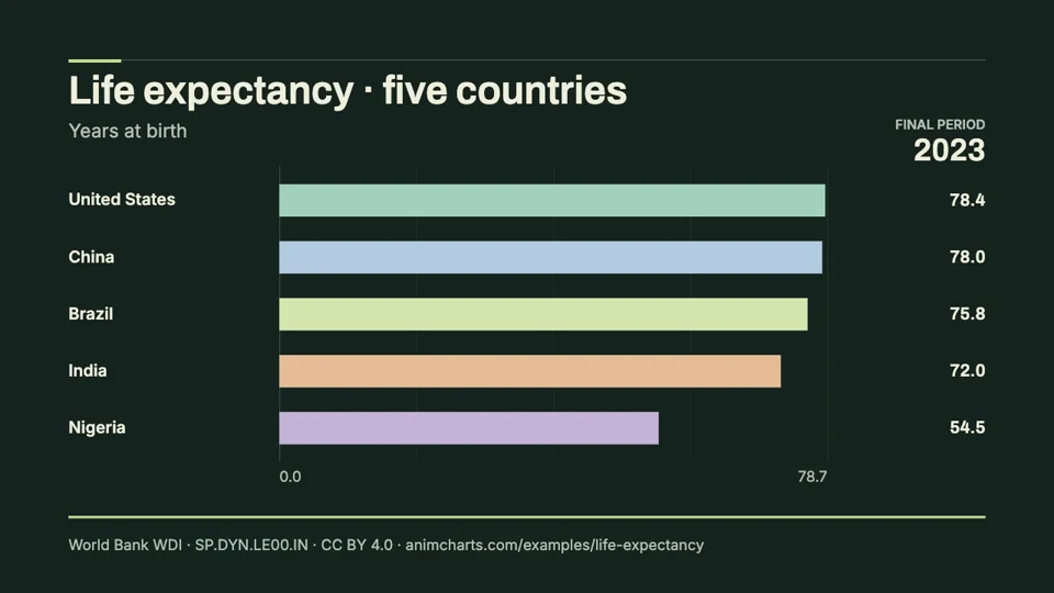
Life expectancy
Compare period life expectancy at birth across five countries using the World Bank series. Download the historical data, watch the animation and edit the same values in the chart-race maker.
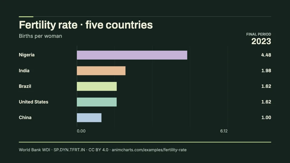
Fertility rate
Animate total fertility rates in five countries from 2000 to 2023. The example includes the historical World Bank values, an MP4 and a CSV you can adapt in the editor.
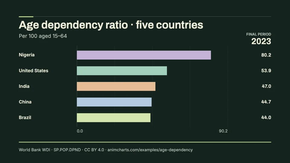
Age dependency ratio
Compare the age dependency ratio in five countries using a ready-to-edit animation and downloadable World Bank data. Values describe people younger than 15 or older than 64 relative to the population aged 15–64.
Make the example your own
Open a dataset in the bar chart race maker, replace the values or adjust its appearance, then export a new clip. Keep source attribution when reusing the supplied data. These are historical examples, not live dashboards or complete world rankings.
The charts, adaptations and explanations are prepared by SupaMakers. The World Bank and its data providers supply the observations. They do not endorse AnimCharts.