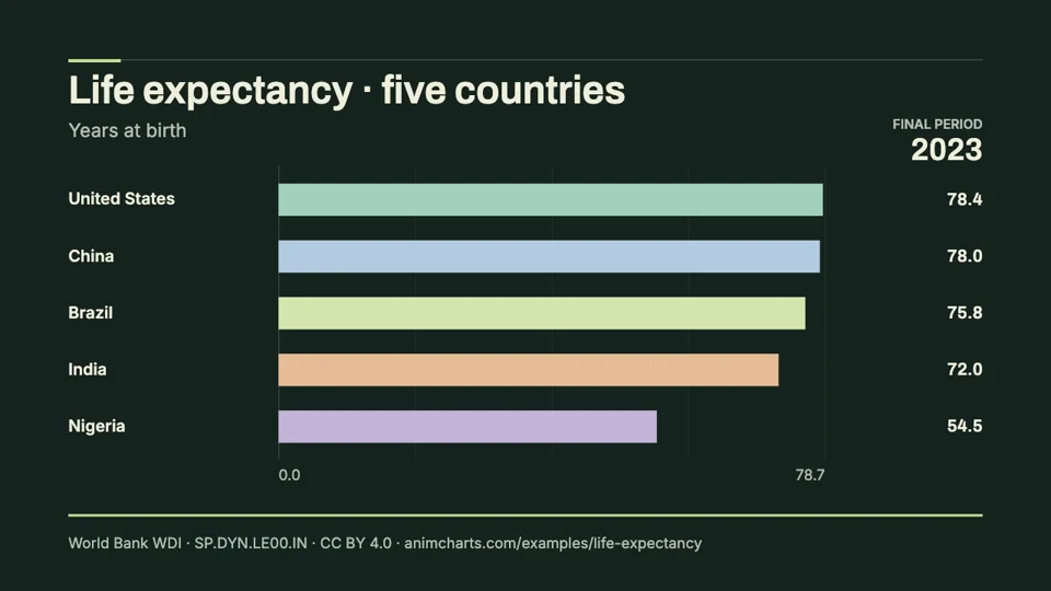
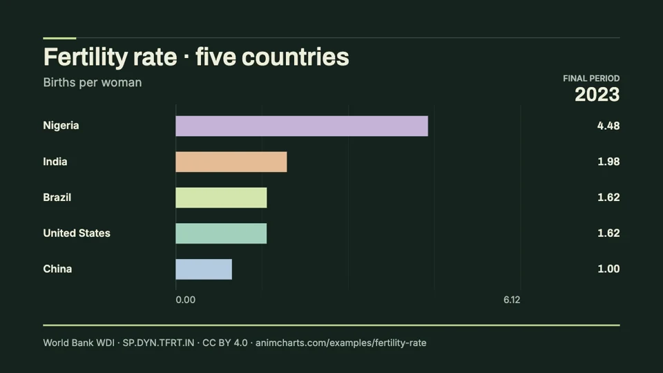
How to read this comparison
Urban share compares proportions rather than the number of city residents. Two countries can have similar urban shares but very different urban populations. The animation is useful for discussing the direction and pace of urbanization within each series.
Use it in your presentation
Use the example in an urbanization or settlement-pattern lesson. Keep the country-level scope explicit and pair the clip with the table when discussing small changes. To explain the number of urban residents, use a separate count series rather than relabeling these percentages.
The data behind the animation
Unit: Urban population %. The table contains the input observations used to render the clip. The video displays 1 decimal place; the CSV preserves up to four.
| Year | Brazil | China | India | Nigeria | United States |
|---|---|---|---|---|---|
| 2000 | 81.1484 | 36.432 | 27.647 | 43.2785 | 79.0741 |
| 2005 | 82.9839 | 42.99 | 29.0945 | 47.5656 | 80.1962 |
| 2010 | 84.3438 | 49.234 | 30.9042 | 51.6778 | 80.6998 |
| 2015 | 85.6936 | 57.3298 | 32.5473 | 55.7326 | 80.5708 |
| 2020 | 86.9112 | 63.5234 | 34.1287 | 59.766 | 79.9975 |
| 2023 | 87.616 | 65.5301 | 35.0677 | 62.1747 | 80.0716 |
Method and limitations
Countries define urban areas differently. Administrative reclassification and estimation methods can affect the series. Cross-country differences therefore do not represent a universally identical density threshold, and these national averages hide differences between individual cities.
Values are retained in the source unit and rounded to four decimal places in the reusable dataset. Six observation years are selected: 2000, 2005, 2010, 2015, 2020 and 2023. Every selected country has a value at each chosen year; no missing value was filled. This frozen historical range makes the examples comparable and does not claim to include the latest available observations.
The animation uses a fixed zero-based scale and linear value interpolation, with time proportional to the year gaps. The bars reorder numerically; changing row position is an animation effect. The clip lasts ten seconds at 30 fps, including an opening pause and a 1.5-second final hold.
Source and reuse
Attribution: The World Bank: World Development Indicators: UN Population Division, World Urbanization Prospects. Animation, selection and presentation by SupaMakers. Retrieved September 8, 2026. The data provider does not endorse this adaptation.
- Indicator
- SP.URB.TOTL.IN.ZS · Urban population share
- API extract
- View the source observations
- Data release
- 2026-07-13
- Reuse terms
- CC BY 4.0 with the World Bank dataset terms. Preserve source attribution and identify adaptations when sharing the data or clip.