Bar chart race maker
Paste a table.
Download the story.
Turn changing values into an animated ranking. Paste a spreadsheet, keep your labels and source visible, and download a free MP4 or GIF. No account or watermark.
The editor is loading. If it does not start, reload this page or use a downloadable example.
Save your settings and data as a file to continue later.
Inspect the underlying values
How to make a bar chart race
- Paste your table. Use one row per period and one column per series. Copy cells from a spreadsheet or import a CSV. The first row supplies the names.
- Set the context. Add a title, unit and source. Choose proportional time for numeric years, or equal spacing for labels such as Q1 and Q2.
- Preview the result. Play, pause or scrub to examine changing values and order. Expand the underlying table to check your data.
- Download your MP4 or GIF. Keep the project JSON and CSV if you want to reuse your work.
What is a bar chart race?
A bar chart race shows values changing across a sequence of periods. Bars change length and move between rows as their values cross. It works best for a small, clearly defined comparison group whose order or gaps change over time.
This tool uses one fixed scale for the entire clip, including zero. Signed data can extend to either side of zero. The numerical order is descending; a higher value does not necessarily mean a better outcome.
How are intermediate values calculated?
Values interpolate linearly between adjacent rows. In proportional mode, a ten-year gap takes twice as long as a five-year gap. The period display marks transitions between observations. Intermediate frames are animation, not new measurements. Exact ties retain column order; visual row movement settles around a crossing.
What happens to missing values?
Blank or non-numeric cells stop the export with a row-specific message. They are never silently converted to zero. Correct the source, explicitly supply a justified value, or remove the affected series or period before proceeding.
Where is my data processed?
CSV parsing, preview and video rendering run in your browser. AnimCharts collects aggregate page visits and tool events with Plausible; chart values, captions and uploaded files are not included in those events. Saved project files stay wherever you download them.
What can I export?
Silent H.264 MP4 at 30 fps. At 720p, landscape is 1280 × 720, square is 720 × 720 and portrait is 720 × 1280. At 1080p, these are 1920 × 1080, 1080 × 1080 and 1080 × 1920. Animated GIFs loop at 20 fps, with a 960px longest edge: 960 × 540, 960 × 960 or 540 × 960. The GIF file limit is 32 MB. Choose 5, 10 or 15 seconds. The first observation holds briefly and the ending stays visible for 1.5 seconds.
CSV files are limited to 50 KB, with 2–8 series and 2–24 periods. Values may range from −1 trillion to 1 trillion. Short Latin-script labels are supported. MP4 needs browser H.264 encoding; GIF uses a browser worker. GIF has a limited colour palette, and long labels or large numbers can be small in portrait output; use landscape or 1080p MP4 for dense charts. Transparent backgrounds, audio and Excel workbook uploads are not supported; paste spreadsheet cells instead.
Start with data you can inspect
Six examples with source links, reusable tables, downloadable clips and a clear explanation of what the animation means.
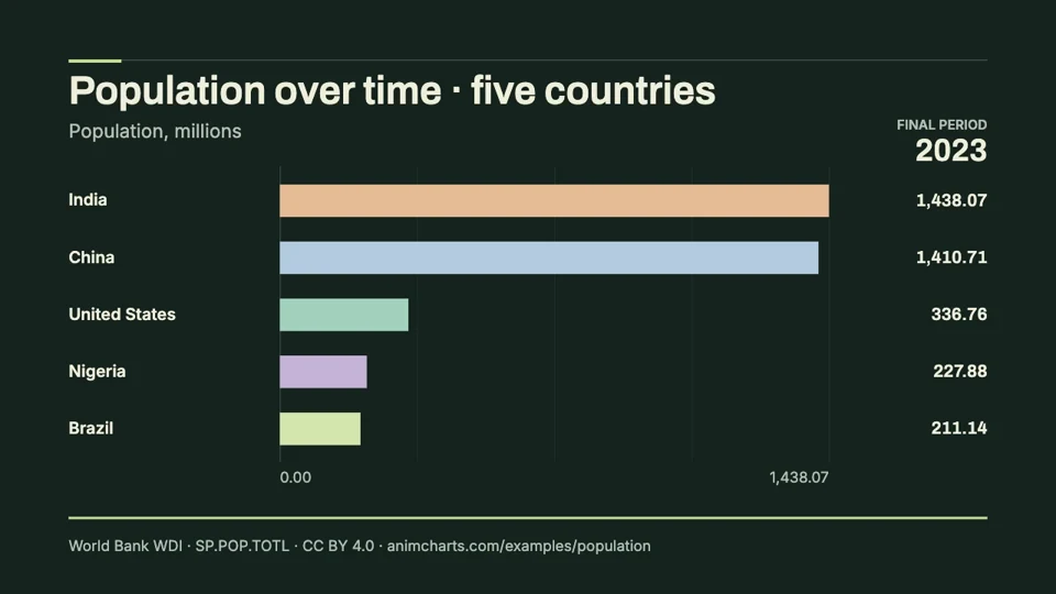
Population over time
Compare the changing population sizes of Brazil, China, India, Nigeria and the United States. This editable animation uses World Bank midyear estimates and a fixed scale measured in millions.
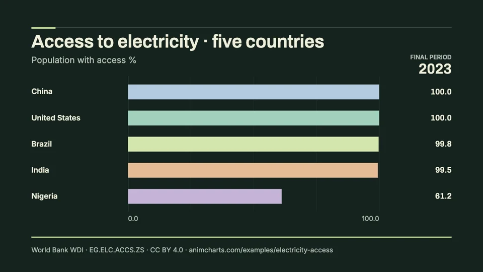
Access to electricity
Animate the share of residents with access to electricity in five countries. The downloadable CSV and MP4 use World Bank electrification estimates, with values expressed as percentages of each country’s population.
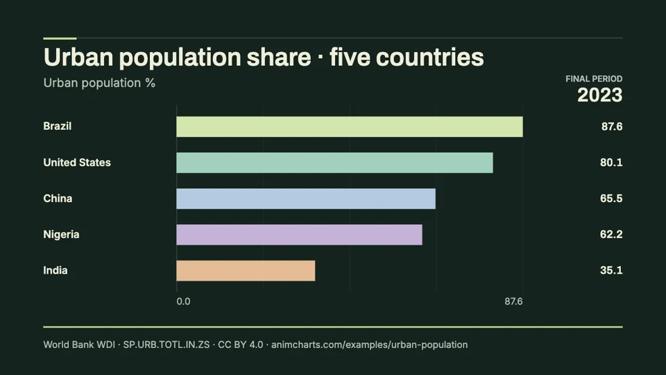
Urban population share
See how the proportion of residents living in urban areas changes across five countries. This ready-to-edit chart race includes the World Bank series, a reusable CSV and a downloadable video.